
Encounter Note
Case study
background
The Encounter is a recorded document/interaction between a patient and healthcare provider(s) for the purpose of providing healthcare service(s) or assessing the health status of a patient. The Encounter is an interaction rich feature that captures clinical information during a patient visit. The SOAP note (subjective, objective, assessment, and plan) serves as a general framework for providers to approach complex patients with multiple problems in an organized way. Documenting patient Encounters is an integral part of the practice workflow. Being the most utilized feature of the EHR, the Encounter required thoughtful, careful research, and phased implementation of improvements.
the problem
Providers need to review and input patient data in an organized, efficient flow during the patient visit, however, the Encounter format makes it difficult to work through the note in an streamlined, logical manner which adds more time on tasks and frustration causing providers to rely on their memory and input data after the visit.
Goals
Improve efficiency
Increase customer satisfaction
Customers adopt new design 35%
Rework framework that will enable future improvements
Challenges
Transforming the Encounter framework, there was a massive amount of tech debt to address. The Encounter hadn’t had a major update for over 7 yrs.
I also needed to garner support and collaborate with different teams and stakeholders and find the opportunity to get this project onto the roadmap.
Change from our user’s perspective is disruptive to their day to day, adding more time on tasks. Our users have grown accustomed to the Encounter format although very inefficient, practices developed workarounds and interesting behaviors to work with the Encounter. So we had to be very mindful of the rollout of these major updates.
my role
This project was a design driven initiative and my role as lead designer included responsibilities like developing a vision for the Encounter, prioritize meaningful improvements, and collaborating cross functionally to drive impactful changes to this feature that needed a lot of love. This feature has been released 07/2021.
team
UXR (Victoria+Megan)
ENG (UI + QA + Services)
Program Management
Education
Customer Service
Research
User Forum Research
The initial discovery phase of the Encounter involved analyzing feedback from the past 5 years from our user voice forum, discussion with the Customer Service team, and shared anecdotes around our current charting experience. We wanted to understand current usage patterns and pain points.
Initial findings from user forums expressed:
Issues of legibility, findability, and data density, it is difficult to digest the data and requires a lot of scrolling to find the right information.
Users found it difficult to separate historical data from past Encounters they’d reference while they input new notes
The flow of sections did not match how providers ideally go through a visit causing users to scroll back and forth. Users have had to adapt their process to the way we designed the Encounter rather than the way that feels most natural in a patient visit.
The note was not efficient, it took several clicks to start entering data
Next I reviewed the Encounter through a design lens to identify:
Accessibility issues with our headers that looked dated and contrast issues that pulled too much focus from the data itself
Design was not responsive, didn’t use the screen space efficiently- users want to consume more data to make better decisions
Data rich page needed better organization and sectioning that makes it easier to access and find data
The Encounter sections had different interaction patterns, creating a disjointed and jarring experience that broke user focus. Some sections would open detail panes, modals, a new tab.
Next we wanted to engage customers in generative research to get a better understanding of how/who uses the Encounter, what works well, what doesn’t.
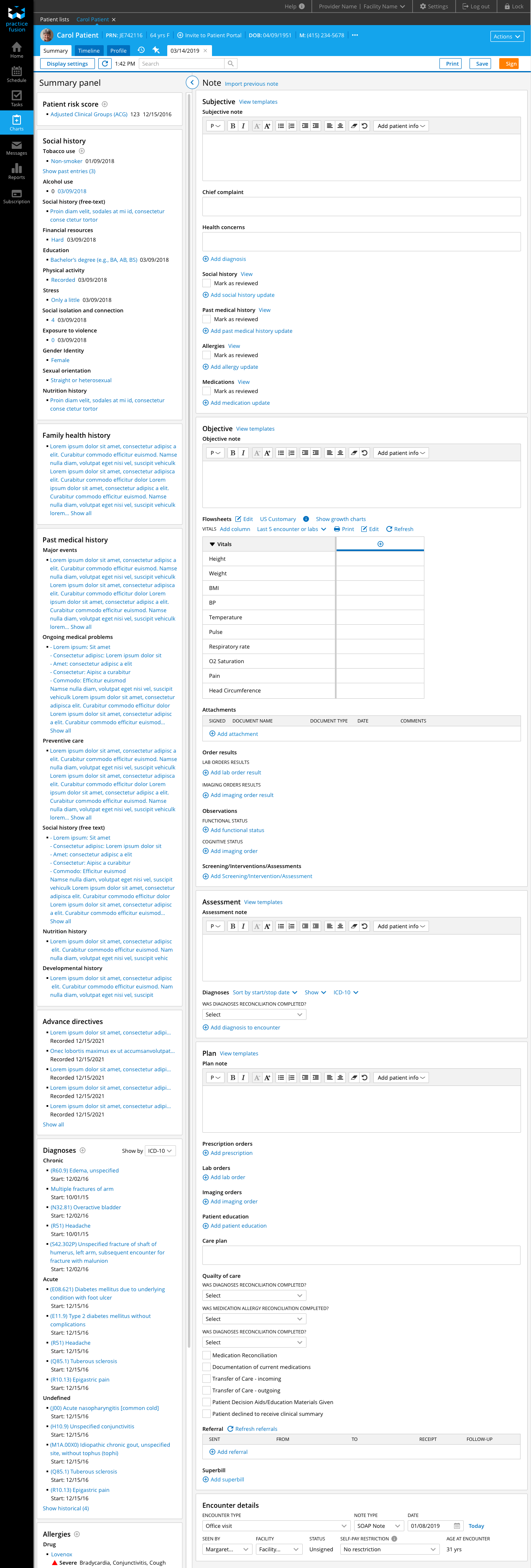
Current Encounter
1st Round of research
User forum feedback gives a partial story, so we wanted to engage with users to validate what we heard from the forums and we wanted to get a better understanding of who uses, what sections used, and the sequence users work through the page. Collaborating with UXR, I listened in on 7 generative research interviews. Our findings revealed the primary users of the Encounter are providers and secondary users are nurses and medical assistants. Users reported visits are fast, providers max their schedules and pack their days with patient visits that last as little as 10 or 15 min. They’re seeing 30-40 patients. Efficiency is very important when documenting in the Encounter. The patient visit is broken up into 3 phases:
Pre-visit nurses/MA are checking vitals, reviewing medications, and other pmh with patient
During the visit providers are recording directly into the SOAP note or focusing on patient and remembering what the patient reported (inputting is too time consuming)
Post-visit providers are recording into the SOAP note, relying on their memory to record information after the visit or at the end of the day.
We got validation that many sections are skipped, the order of sections did not fit the way providers see patients, there’s excessive scrolling making it hard to navigate, inputting notes felt tedious. User goals: Focus on the patient, Review relevant information, Input information
With this feedback we created an affinity diagram and started to build out a customer journey map for the Encounter. Throughout this process we worked with the Customer Success team in workshops and diagraming to further validate our findings and assumptions.
Encounter customer Journey map - focus on Provider with patient
design
I started my design process by creating wireframes to address user issues. In my wireframes,
I adopted a card based layout to organize the data, address the inefficient visual design and data density issues. A card layout will organize the data and help users find information more quickly
I visually separated reference data in summary panel with newly inputted data collected during the visit. This helps users move through referencing historical data and documenting new in a more organized fashion and improves efficiency.
Matched Encounter framework with clinical workflows by rearranging sections. I reordered the sections to follow the natural flow of the visit,
Direct input into SOAP fields and other data entry elements- easier to enter data quickly
Utilize the screen real estate taking advantage of large breakpoints to more access to information. We found that a lot of our users access our product in larger screens


2nd ROUND of research
Working with UXR, we conducted usability testing phone interviews with 14 practices. I created 2 designs that feature different layouts of the SOAP sections + tested these designs against the current Encounter.
Stacked SOAP features sections stacked on top of each other helping users flow through the linear visit.
Tabbed SOAP features sections on different tabs. I hypothesized that providers needed to focus on each SOAP section at a time and the tab layout would support that behavior.


Our research revealed:
Some users want to see other SOAP fields together while charting. They wanted to review SOAP sections together as they can with the current Encounter.
Users expressed their ideal layout would allow them to choose between stacked and column format to give flexibility on how they’d view the soap sections
Left-side panel may take some getting used to but still very valuable
So this round of research revealed that some users expressed a column layout would improve efficiency and visibility of the complete visit. I wanted to engage users in another round of research and test this column concept out.
3rd Round of research
We conducted usability testing and tested 3 different layout options. We engaged 9 practices. We tested three layouts:
Stacked SOAP features sections stacked on top of each other helping users flow through the linear visit.
Focused SOAP features expand/collapse behavior to focus the user on a section at a time. I included this option to get further validation that providers reference SOAP sections together and need them visible.
2 column SOAP features a layout with SOAP sections all together, something providers reported would be helpful as they reference sections as they input and a 2 column supports a more high level view of everything done in the visit
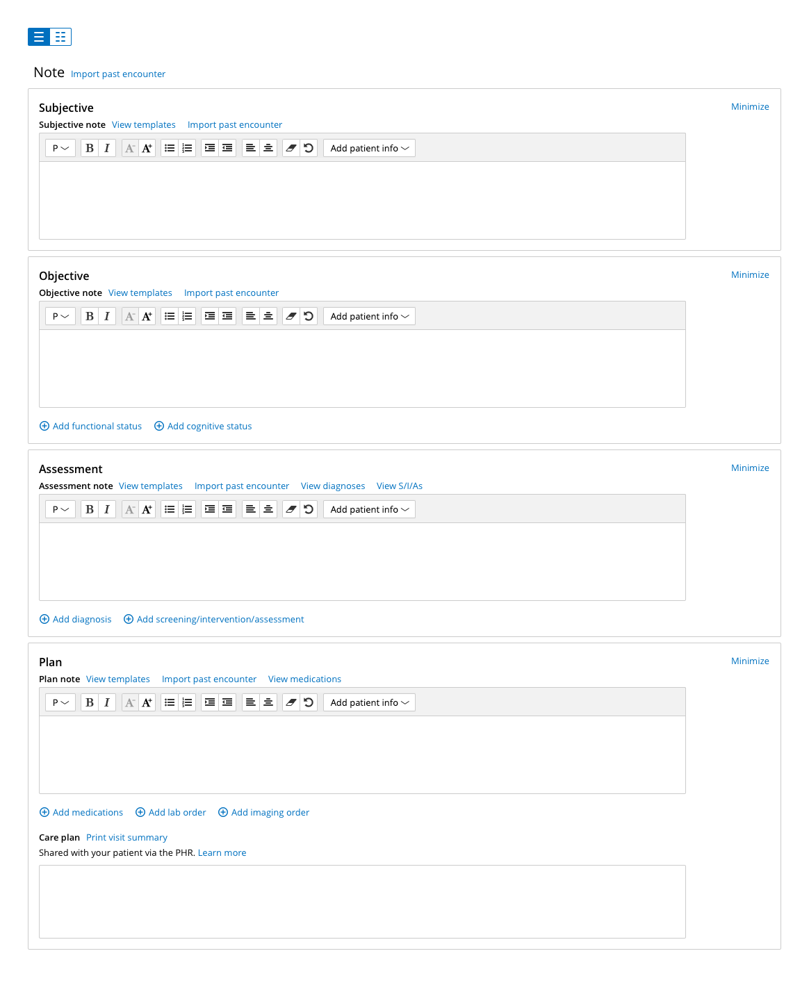
We found that overall, participants were able to navigate through the new designs unprompted with mentions of being more organized and easier to read. The left-hand Summary panel is a welcome update. We didn’t get a clear feedback on the preferred layout between between the stacked and 2 column layout. Accounting for the amount of changes for the Encounter and being mindful that our users really hate change, I decided to descope the 2 column layout and moved forward with the Stacked layout as a more conservative design.


final design


The new design features:
A card based layout- addressing inefficient visual design, data density
Matching Encounter framework with clinical workflows by rearranging sections and removing redundant information
Direct input into SOAP fields and other data entry elements- easier to enter data quickly
Utilization of screen real estate, taking advantage of large breakpoints to display information
Implementation
Here’s the implemented final design against the old Encounter. I worked closely with UI devs and our UI platform team to implement updates to the Encounter and any updated components. Again, the final design achieves:
Restructuring of the framework to match user expectation and updating visual styling to improve findability of data.
The new Encounter separates reference data from the visit document by placing all Summary cards into a dedicated closable panel. This way users have the ability to quickly reference the patient’s chart without losing their place in the Encounter and close the panel when reference information is no longer needed.
I advocated for beta testing, an opt-in switch, and feedback survey for users to try the Encounter at their own time and leave detailed feedback. I felt it was important to have users opt-in to the new experience rather than releasing the new updates outright for a more controlled release to anticipate any bugs or major issues with the new design. As I mentioned the Encounter is a high touch feature with lots of risks and used every day by practices. Users don’t have time to try new designs during their day while they’re seeing patients, it can disrupt the flow and the critical focus is to serve their patients.

Opt-in switch and feedback survey link
BETA FEEDBACK + SURVEY RESULTS
We received a over 1,400 responses from a variety of specialties. 35% of respondents felt the new design meets expectations, while 33% feel it does not.
Dislikes:
Writing notes takes more time when you can’t see SOAP simultaneously, providers reference different areas of the SOAP as they complete the Encounter.
Layout of note is too cluttered/complicated and lots of scrolling to navigate through the Encounter
Not using all horizontal space- inefficient use of space on larger screens & when panel is closed- users are hyper critical about space.
Can’t quickly find or jump to sections - reordering of sections causes confusion and discomfort for users
Likes:
Side-by-side summary panel
Useful reference
Keeps patient’s chart at the forefront of provider’s mind when charting
Sections are more distinct and easier to read
Better use of screen space and greater visibility of information on one screen
More intuitive and streamlined flow
Beta-feedback iterations
Working with Megan, our lead user researcher, we categorized feedback into a table on a confluence wiki to track decisions, priority, jira tickets, and solutions to address complaints. We were able to identify what were bugs and gaps in the design, creating a strategy on how to address the feedback.
Feedback: Layout of note is too cluttered and doesn’t use space efficiently
Solution: Reduce cognitive load by eliminating empty states and building inline subsection links


Feedback: Inefficient use of space on larger breakpoints and when panel is closed
Solution: Expand the Diagnosis and Medication list to full width of section card


Feedback: Writing notes takes more time when you can’t see SOAP notes simultaneously, users need to reference different areas of the SOAP to complete notes
Solution: 1914+ Breakpoint will have 1 column and 2 column format view to allow users to see SO and AP sections side by side

Metrics
After releasing the Framework phase of the project, we look to Mixpanel tracking to review if these new designs are meeting the goals of this project. The first 30 days after 100% flight, we had 12% of users creating an Encounter with the new design on, which is below our 35% goal. We anticipated a slower adoption as our users are change adverse. The Encounter is used everyday, users don’t have time or capacity during their work hours to learn a new design, it’s uncomfortable and doesn’t feel efficient, takes time to get acquainted with major changes in visual and interaction patterns. I want to stress that our providers need an Encounter that is quick to input, they’re seeing an average of 30-40 patients a day. Today we’re seeing 25% of users creating new Encounters with the new design turned on.

First 30 days after 100% flight


Metrics as of June 2022

conclusion
“I appreciate the new layout of the screen and separations of the different Encounter sections. With the above mentioned in mind, the flow is much better in my opinion, making it easier to access the sections I need to do my portion of the charting information.”
— Practice Fusion Provider
“I really appreciate the clean look of the new encounter. I like that the PMH is available in the summary panel. Furthermore, I also like the ease of entering information into SOAP note.”
— Practice Fusion Provider
The ENG team dedicated a year working tirelessly to improve the Encounter experience for our users. The Encounter is a high risk feature with heavy interaction in the EHR that shapes a practice’s day to day. This project was a great opportunity to implement an opt-in switch as well as beta-testing to ensure these improvements met user expectations. We are currently working to beta-test the Customization phase of this project with our Client Advisory board to pressure test the usability of Encounter display settings.
Learnings
Quantitative usability testing and measuring success
Defining more measurable goals with program management
Utilization of opt-in switch and feedback survey
Account for tech debt and collaborate ASAP
Improvement to features reinforces trust with users and commitment
There is a limit to user testing
We learn the most about the varied ways users accomplish tasks and their workflows after release. Taking time to review mixpanel data and tracking bugs, listening to user complaints that come through, these are all steps to continuously learn and strategize how to further improve post release. This project was an important exercise in laying down a foundation to set the team up for success and breaking down large projects to make strategic informed decisions that build off each other.
Next steps
Next steps, we have items that have been descoped from this project with designs ready to implement. Our ENG team finished implementing beta feedback changes giving time for our users to explore the new Encounter and data gathering through Mixpanel and CS. We are in the process of conducting beta-testing with our Client Advisory board for customization. If we have time I can show the evolution of customization functionality.
Ready to implement
Skeleton state
Focus state/keyboard navigation
Improvements to rich text editor
Import past Encounter to include attached diagnoses and medications
Implement print visual design improvements
Future
Clinical templating improvements
Streamline prescription (eRx) flow
Signed Encounter
Flowsheets overhaul
Screening, Interventions, Assessments
Lab orders/results attachment
Assessment and Plan workflow
Reconciliation