
Encounter Customization
IN PROGRESS
background
At Practice Fusion, we serve providers from a variety of specialities which requires the EHR to be flexible enough to accommodate the unique needs of each specialty. Customization of the Encounter note is one of the highest requested improvement for the feature. Being able to customize the visit note would allow providers to build notes that include specific workflows for their speciality needs.
the problem
The patient encounter has limited customization functionality which forces users to adopt a framework/workflow that doesn’t work for their specialty. Limited customization prevents specialty providers from conducting effective treatment and gaps in their workflow.
Goals
Provider richer customization functionality and flexibility with note types and display of sections
my role
This project was a design driven initiative and my role as lead designer included responsibilities like developing a vision for the Encounter, prioritize meaningful improvements, and collaborating cross functionally to drive impactful changes to this feature that needed a lot of love. The customization phase of this project will be beta-tested in 08/2022.
team
UXR (Victoria+Megan)
ENG (UI + QA + Services)
Program Management
Education
Customer Service
design
Building on top of existing customization, I focused on incremental improvements to the design and access to customization settings. While the ENG team was developing the Encounter framework improvements, I created designs around building richer controls around customizing the Encounter layout. I started by observing and analyzing the current customization settings.


Existing customization is limited to showing and hiding sections within a dropdown ‘Go to’ menu, not very discoverable and under utilized by users. Lack of discoverability as well as how settings are applied by practice vs user.
Version 1- Iteration builds upon the current customization option, pulling the action to customize into a more discoverable location in the toolbar and focus within a modal detailing how customization would be applied.
Version 2- Improved functionality around providing richer customization, allowing users to show/hide sections and rearrange sections to their practice needs. This iteration provided a dedicated space for users to focus on how they’d ideally like to customize their encounter.
Customization
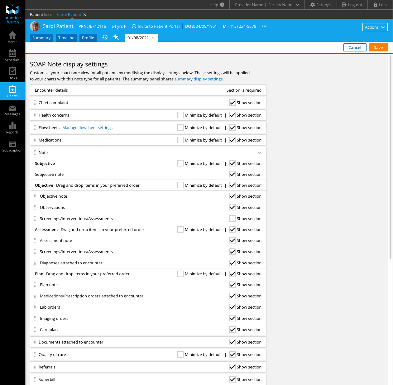
While gathering beta-feedback, the ENG team dedicated their time and effort to building out the richer customization users have been requesting for years. From early phases of research, we were well aware that our customers practiced in a variety of specialties and needed an EHR that was flexible enough to accommodate their specialty needs. Our customers are always looking for ways to fine tune their EHR to feed their practice needs as well as meet specialty regulatory requirements. This poses as a lofty challenge for our teams, building an encounter that meets most customers needs while balancing a good level of customization and flexibility to make the encounter work for different specialties. As referenced earlier, customers reported wanting to remove different sections of the encounter that were not relevant to their practice/specialty.
DESIRED FUNCTIONALITY
Show/hide sections
Change order of sections
Minimizing sections by default
Creating multiple customized encounter notes for different visit types
Settings page to manage all customized notes
Customized note types set by admins with customized display settings set by user
Design changes
Version 3- Fine tuning interactions and visual styling to improve customization functionality. V2 cards gave a clear visual of sections however generous padding in section containers created cumbersome interactions when trying to rearrange sections and difficulty to see the whole encounter view without scrolling. Design team feedback also pointed out the misuse of toggle switches, resulting in changing the toggle switch to checkbox to correct show/hide control of sections.
Toggle switch controls to checkbox to correct the incorrect interaction pattern
Condense the visual styling to accommodate drag and drop functionality
The initial design of each section made it difficult for users to see the full view of the encounter sections and make decisions on the order they’d ideally like to see these sections
Grouping SOAP sections to imply parent child relationship to Notes sections

conclusion
We are currently working to beta-test the Customization phase of this project with our Client Advisory board to pressure test the usability of encounter display settings.