
Electronic Prescribing
IN PROGRESS
background
Current strategy is to combine prescribing features that exist in two separate products with two different sets of customers. We plan to release a new unified product to Practice Fusion users with the end goal to migrate Veradigm ePrescribe users to the Practice Fusion eRx only product. With two customer groups and two very different mental models/workflows in prescribing, the intention of this project is to increase efficiency and simplify the workflow to prescribe a medication. We have a good understanding of what Practice Fusion customers like and don’t about our eRX feature from past research. The Veradigm ePrescribe team has never conducted user research, however, the ePrescribe workflow offers functionality that Practice Fusion customers have asked for.

the problem
Providers need to prescribe multiple medications per patient as efficiently as possible, however, the current prescribing flow has too many steps and requires many clicks to complete the prescribing flow.
Goals
Create a single electronic prescribing experience for Practice Fusion and Veradigm customers.
Improve time on task, reduce number of clicks, increase success rate, and ease of user rating
Business goal is to retain customers on our platform and attract new customers
Challenges
Working with 2 development teams from Practice Fusion and Veradigm
Evaluating each product, contracts, and differing mental models/workflows
Veradigm ePrescribe product team has no experience collaborating with Design and UXR
my role
As lead designer my responsibilities included: investigating both workflows, creating an efficient, streamlined prescribing workflow that takes the best parts of each product. I collaborated closely with UXR, Program management, Tech leads, UI, and Services to develop requirements and uncover opportunities to streamline the prescribing workflow.
team
Partnered designers
UXR (Megan + Mofé)
Program management
ENG (UI + QA + Services)
Compliance/Legal/Regulatory team
Research
Workflow analysis
The first step in our process was to first understand each product. Our design team had a strong understanding of current user pain points with eRx in our Practice Fusion EHR, however, we did not have any sense of how users experienced the Veradigm ePrescribe product. Working closely with UXR, we conducted several interviews and tested early designs to understand both user groups mental model around prescribing.


1st Round of research
Collaborating with UXR, I listened in on 1:1 interviews and formative usability studies with 2 ePrescribe customers and 7 eRx customers. We wanted to understand the current experience with ePrescribe and eRx with respective users and evaluate the opposite product.
ePrescribe feedback:
PF users
Practice Fusion users liked ePrescribe offers more functionality (saving and sending to 2 pharmacies, saved SIGs/eRX templates, autofill QTY/Days supply, eRX free text/compound scripts, true eRX delegation, quick add recent scripts).
Users did not feel the program was more efficient than PF's current workflow. There were multiple major or blocker usability issues that users were either frustrated or could not determine how to prescribe on their program. The consensus was the program is not intuitive and did not think it would save much time.
ePrescribe users
Both ePrescribe users had a lot of pain points and annoyances in the system
Issues: Don't auto-select GoodRx to print, DAW is not checked when re-prescribing a recent script, a lot of glitches in the program and too many eRX transmission errors
eRx feedback:
PF users
The most common pain point was that eRX has too many steps, especially for existing meds and EPCS. Followed by structured SIGs don't always have the most common instructions and aren't written in a patient friendly way, and pharmacy search is difficult without the zip.
Alerts were also called out as an issue. Users view them as important for some notifications, but most the alerts are obvious and a waste of time to have to enter a reason for overriding.
There are many fields in the workflow that are rarely used, but take up space and require scrolling. (e.g., Day supply, Unit, Internal or medication comment, max daily dose, etc.)
ePrescribe users
They each struggled with different items in the workflow and thought they had to fill out everything that was on the page
2nd ROUND of research
Working with another designer, we created 2 design directions and prototype to concept test with UXR. We engaged 4 Practice Fusion providers in a 1:1 remote prototype concept testing and design walkthrough sessions.


Our research revealed:
Users either liked aspects from both designs or were 50/50 spilt on which design they liked the most. Users felt both designs were better ("cleaner") and more efficient (less clicks) than what is in PF today.
Multiple pharmacy order: All users were excited about the ability to send a multi-medication order to different pharmacies because this does commonly happen throughout the day (~30%).
Record vs. Order: All users knew the difference between Record and Order, but 50% of the users clicked Record to prescribe a new medication. This is likely because we have trained users to record before ordering and we make them click a Record button to order a new medication now in the plan of the encounter
Too much focus and screen real estate on content that isn't always helpful or very rarely used sections. Each piece of content on a page fights for a user’s attention. We should focus users on the most relevant information at each step.
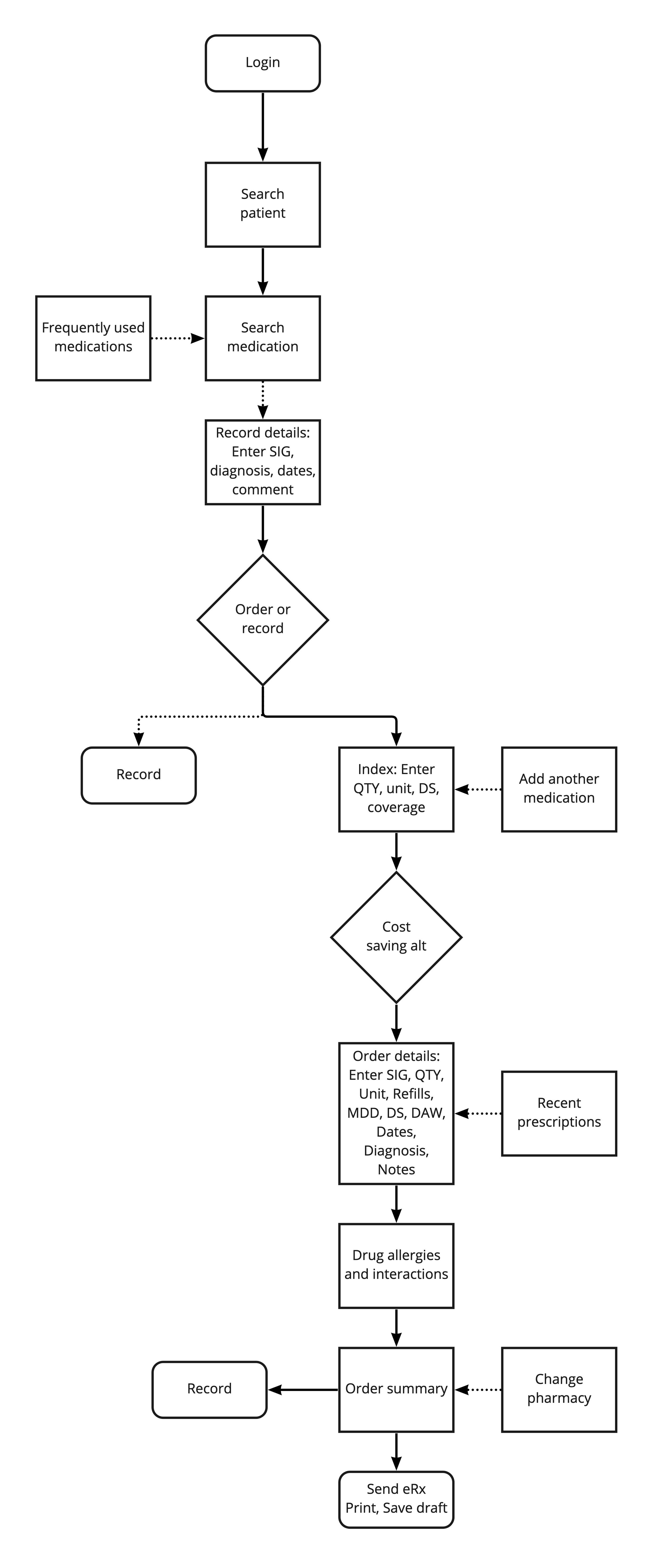
design
Both product workflows push users through several screens. In an effort to reduce the number of steps in the workflow, I worked closely with my Program Manager to reduce the number of distinct steps and streamline the workflow. We focused first on developing the initial step: searching for a medication.
During development, we worked closely with tech leads and our dev team (SVC, UI, QA) to develop solutions around search behavior and prescription favorites. We focused on defining how searching should ideally work to align with user needs. During this time I also made note of specific areas we needed more user insight and areas to test further in the future.
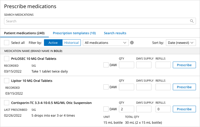
search step
Collaborating closely with George (program manager) we defined search requirements:
Allow the user to search from 3 lists: Patient med list (active/historical), Prescription templates, Search results
When searching for brand/generic, display brand/generic options in results
Allow the user to filter the patient med list by active/historical, recorded/prescribed, date, and alphabetically
With early designs, I worked with our ENG team to understand database calls and implications to search from my designs. This collaboration allowed us to marry user insights with what is technically feasible.

order step


prescription templates settings
Collaborating closely with George (program manager) we defined prescription favorites:
Introduce new setting that allows providers to create templates for most commonly prescribed medications enabling users to prescribe more efficiently
Allow the user to save up to 20 templates